
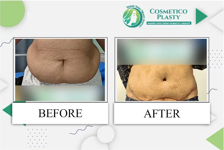
 English


How Can Businesses Improve Layouts for Custom Food Paper?
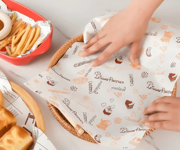
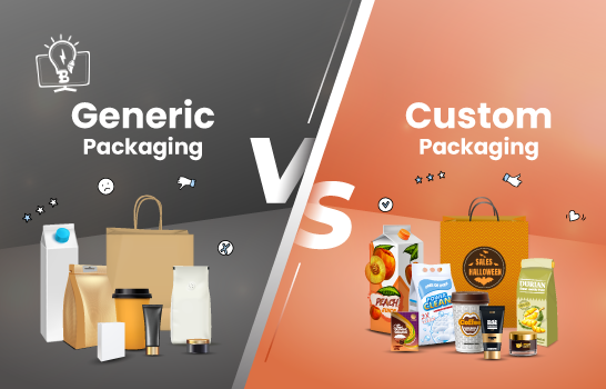
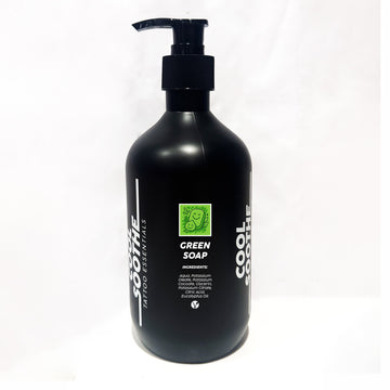
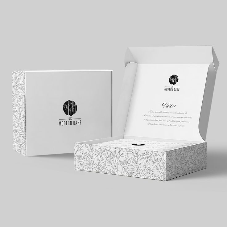
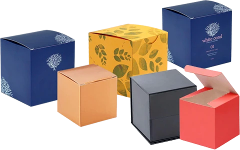
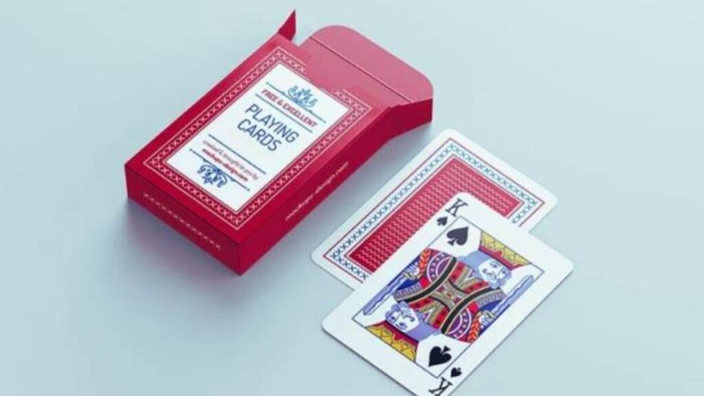
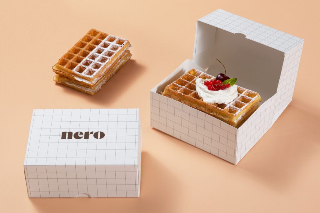
Presentation is as important in the food service and packaging world as taste. Companies now realize that the way customers perceive quality depends on the packaging. Custom food paper has been a trusted option among dining establishments, baked goods, and fast-food companies that aim to incorporate a touch of professionalism and design. The question is how to make layouts more useful and more visual. Effective layouts make sure the printing spaces are utilized, the text and graphics are crisp, and the patterns match the product. Even the best type of paper may appear unappreciated unless the appropriate layout planning is done. With optimization of layout, brands experience consistency in packaging, save time, and costs. This blog discusses effective strategies that may make custom packaging unique in a competitive market.
Layout Planning
The initial measure toward successful layouts is knowledge of the equilibrium between planning and operation. The packaging should appear attractive and should also be efficient when used with food products. As an example, paper bag designs should be done in a way that the logo can be seen even when it is folded. Safe zones, margins, and bleed areas on artwork must be measured well to prevent trimming errors. Planning also involves the size of the items that are being packed or wrapped. What would seem to be an excellent layout on the screen might not come out correctly when printed without considering the dimensions. Having a clear structure will make branding visible and consistent. Correct measurements will help businesses remain professional.
Design Balance
Symmetry and proportion determine the appearance of layouts after they are used in actual contexts. A design on a custom food paper should have repeating patterns to ensure that there are no gaps or lines when it is cut into sheets. A clean finish is achieved by balanced spacing between logos, icons, or brand text. Branding elements must not be overdone; they should be used in a way that allows the customers to naturally focus their attention. The negative space has been used in a strategic manner to make the design breathe and appealing. Ignoring balance can make the packaging look untidy, and it can take attention away. When the packaging of the brands is designed well, customers develop confidence in the brands.
Material Focus
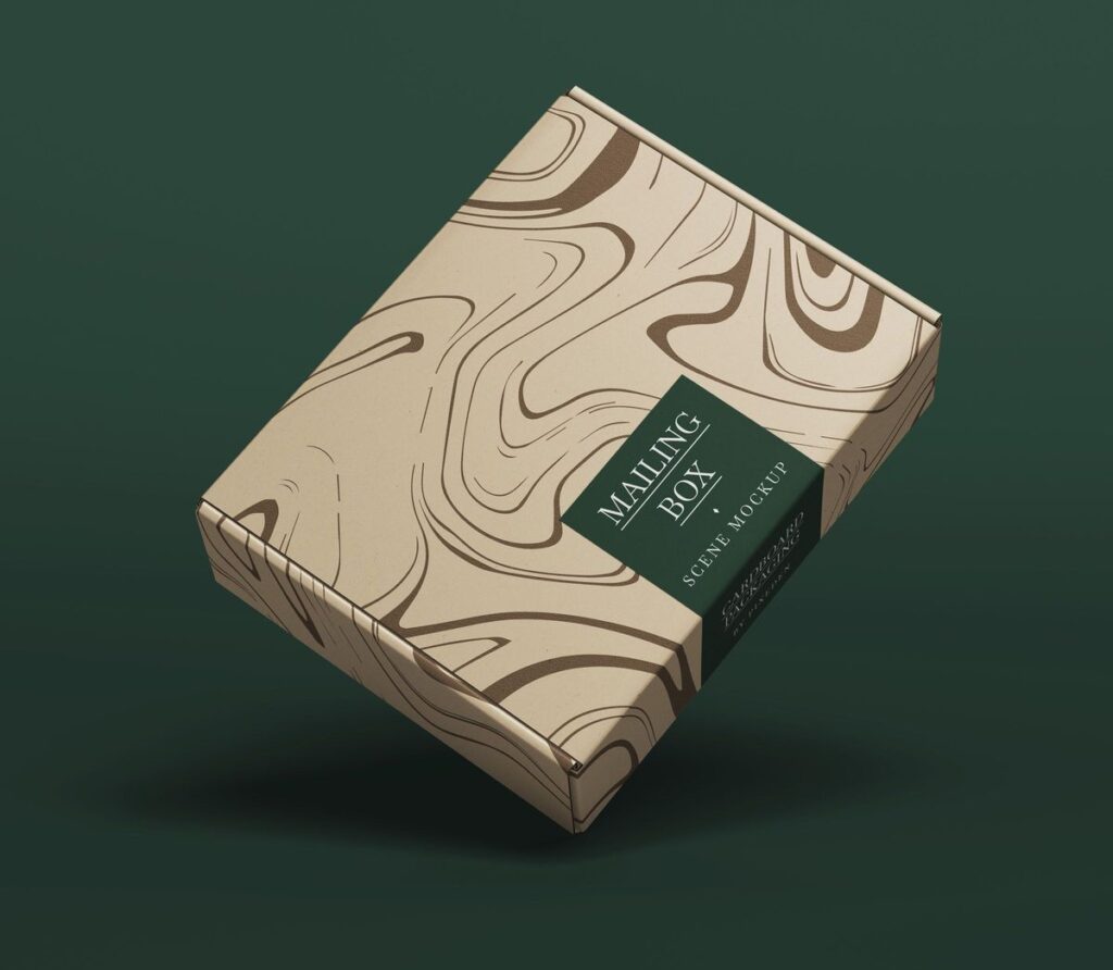
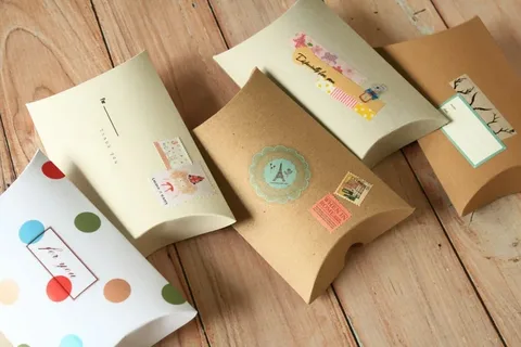
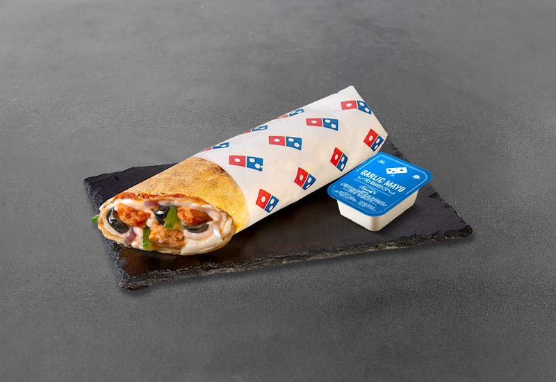
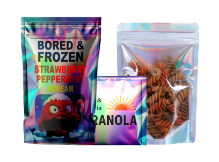
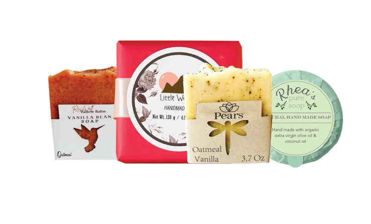
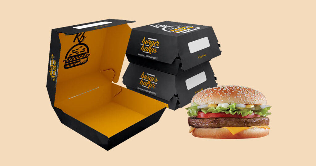
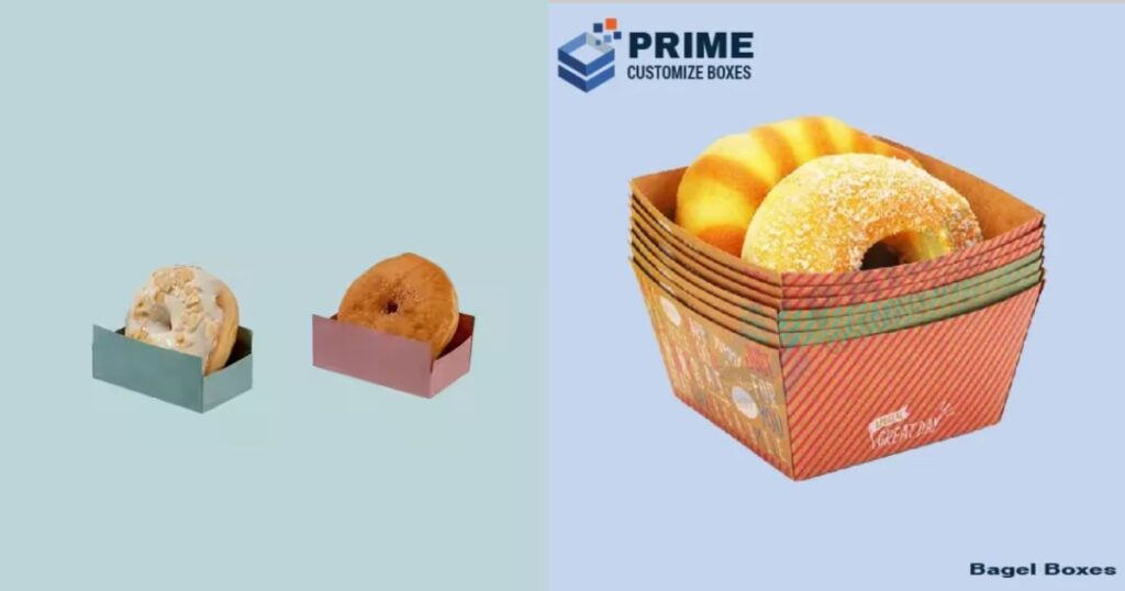
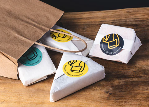
Various types of papers require different methods of layout. As an illustration, the food pack wrap will need designs that will accommodate individual product wrapping, where logos and designs will have to be placed in the center. Continuous materials, on the other hand, enable the ability to repeat designs without worrying about alignment at each fold. By learning the features of each type of paper, designers are able to optimize them. Layouts should be determined by material thickness, finish, and durability. A slick or coated surface can reflect light in different ways that affect the use of color in designs. When layout requirements are taken into account when selecting the materials, the packaging performance can be significantly enhanced. This is a strategy that enhances brand identity as well.
Print Precision
The success depends on the accuracy of printing. Often, ill-fitting prints can dilute the impact of a carefully considered design. Printed food paper should pass through a fine printing process in order to be clear and sharp. They need high-resolution files to prevent pixelation and to be able to scale, and they use vector graphics. Color testing needs to be done in advance by designers since, when it is printed on textured surfaces, the shade can change. Shifting of design can be avoided by ensuring that the designs are properly registered when printing. Consistency across batches builds customer confidence. Lack of accuracy in the packaging can be a negative indication of how a brand takes quality seriously. Mercy and clarity of print should never be compromised.
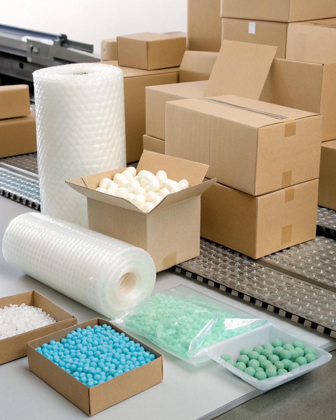
Durability Needs
Layouts also rely on the durability of the packaging that needs to be used. Wax food paper layouts should emphasise resilience when dealing with greasy or moist products. Areas where there might be substantial exposure to oils and which might cloud logos or other brand features should not be used in designs. Ink should be smear and fade-resistant. Durability also connects with usability, which helps keep packaging looking tidy as we handle it. Where layouts take this requirement into consideration, functionality and aesthetics are maintained. This is very common among businesses that sell fried or grilled meals. Good layouts imply that packaging can be stressful without losing its branding value.
Creative Styling
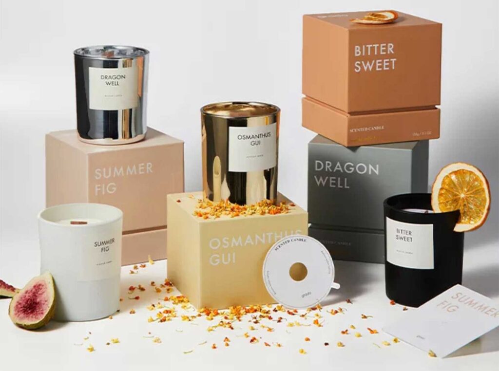
One brand is different from another one through creativity. With custom printed sandwich paper, experimentation with textures, icons, and typography builds visual interest. The use of stylized layouts may include repetitive figures, thematic art, or playful design that is appropriate to the food-related theme. The designs must carry a story, but be easy to read. Packaging with a unique design is usually equated with high quality by customers, so innovative layouts can be highly valuable. It is difficult to be memorable without being too obtrusive to the product itself. Creative styling helps the business to get the attention of the customers, as well as reinforcing recognition through optimization. It results in better branding in competitive markets.
Conclusion
The process of layout optimization on custom food paper is highly organized and includes planning, creativity, and precision. It starts with the knowledge of the kind of paper to use and goes on with design balance and print alignment. Companies should never forget that functionality and aesthetics should always go hand in hand. Laid out food papers come to their rightful place when there is a purpose in laying the food papers. The logos, graphics, c and, and text are placed in such a way that they are visible in every situation. It also creates a sense of consistency, which creates trust among customers as a sign of professionalism. The appeal is increased through create stylish lighting and the functionality is preserved through material durability. Ultimately, packaging thrives on strong layouts, which help a brand to be unique in a saturated market and create value for its clients.