

 English


Using Negative Space Effectively in Van Graphic Design
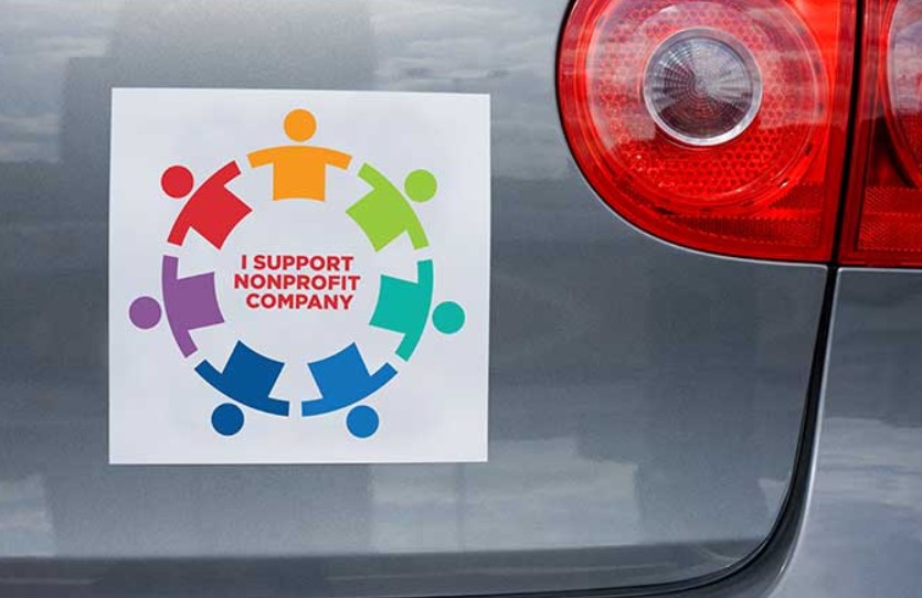
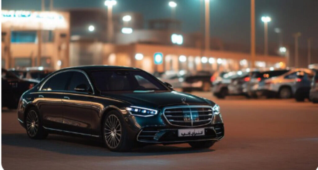
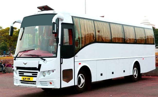
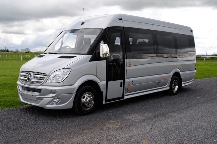
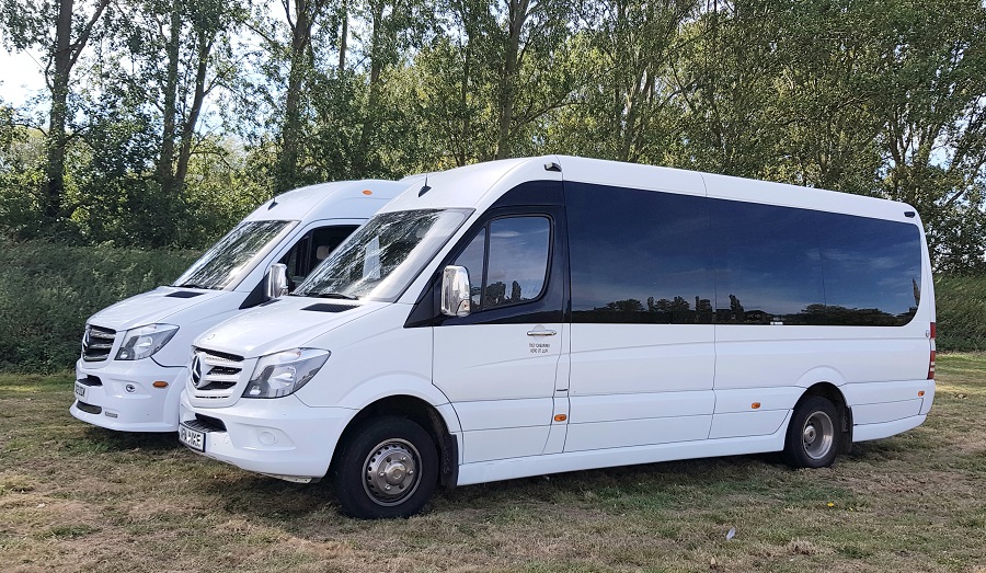
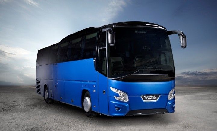
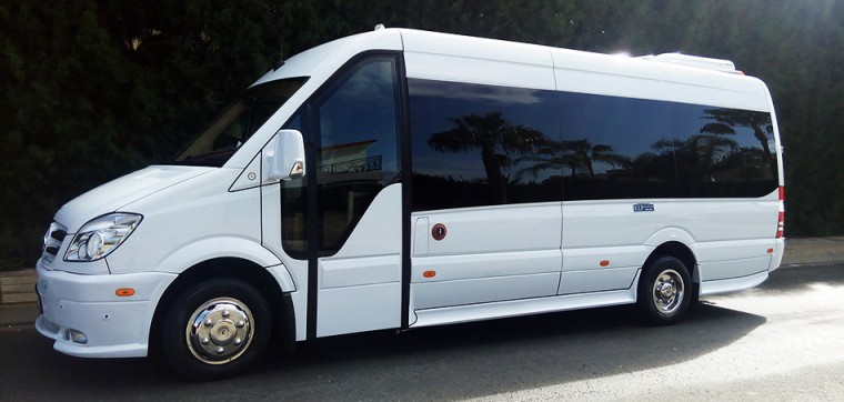
When it comes to van graphics, making a strong first impression is vital. Whether parked or on the move, your van constantly promotes your business. In today’s crowded visual world, a clean, striking design can set you apart. Clever use of negative space – the empty areas around text and images – helps your design breathe and draws attention to key details. Instead of overcrowding your van with information, smart use of space creates clarity and impact. In this blog, we’ll explore why negative space matters in van graphics, how to use it effectively, and common mistakes to avoid.
What is Negative Space in Graphic Design?
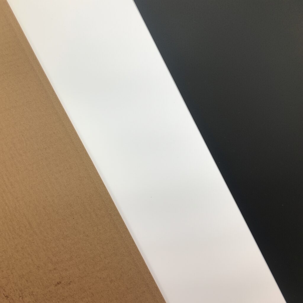
Negative space, often called white space, is the empty area around and between elements in a design. It is not just blank space; it plays a vital role in creating a balanced and visually appealing layout.
In van graphics, negative space helps guide the viewer’s eye towards the important parts of the design, such as your logo, slogan, or contact information. It adds clarity, focus, and professionalism. Rather than appearing unfinished, a design with well-used negative space looks clean, modern, and confident.
Understanding the difference between simply leaving areas empty and purposefully using negative space is key to strong design, especially when your branding needs to work at a glance.
Why Negative Space Matters for Van Graphics
Unlike a static billboard, vans are constantly on the move. This means that people often have only a few seconds to take in your message. Designs that are too busy or cluttered can be confusing or even go unnoticed.
Van graphics need to be simple, bold, and easy to understand from a distance. Negative space allows you to highlight the most important elements without overwhelming the viewer.
When used effectively, negative space makes a design more readable, more memorable, and more professional. A van with a clean, well-balanced design will stand out from the crowd, building trust and recognition for your brand.
How to Use Negative Space Effectively in Van Design
Here are five practical tips for using negative space effectively when creating van graphics.
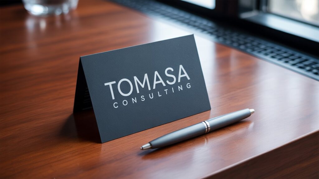
1. Prioritise Simplicity
One of the biggest mistakes in van design is trying to say too much. Remember, less is often more. Focus on the essentials: your logo, a short tagline, and a contact method such as a website or phone number.
Avoid cramming in every service you offer or long paragraphs of text. By keeping the main message simple and giving it room to breathe, your van will communicate more clearly and powerfully.
2. Balance Text and Imagery
When it comes to van graphics, balance is key. If there is too much text, it can look cluttered; too many images can confuse the viewer.
Think about the layout carefully. Allow enough space around each element so that nothing feels squeezed or forced. A balanced design not only looks better but is also easier for people to absorb quickly.
3. Use Contrast Cleverly
Negative space works hand in hand with contrast. Choosing colours that contrast well with your background can make your text and graphics pop. For example, dark text on a light background – or vice versa – will be easier to read from a distance.
Contrast can also be used creatively, such as using negative space to form shapes or outlines that add extra meaning to your design. In sign printing, understanding how colours interact is just as important as choosing the right words and images.
4. Create Visual Focus Points
Your van design should have one or two clear focal points. This might be your company name, a striking logo, or a key message. Using negative space around these elements helps draw attention exactly where you want it.
Think about where the eye will naturally be drawn first. Strategic use of empty space can guide viewers effortlessly through your design, making sure the most important information sticks.
5. Think About Movement and Angles
Remember that your van is not a flat poster – it has curves, doors, and windows. When planning your graphics, consider how the design will look from different angles and how it will move when the vehicle is on the road.
Negative space can help break up the design in a way that feels natural with the van’s shape. Avoid placing important text or images where they might be distorted by curves or panel gaps.
Examples of Great Van Designs Using Negative Space
Some of the most memorable van graphics use negative space brilliantly.
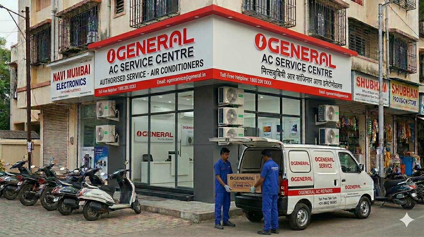
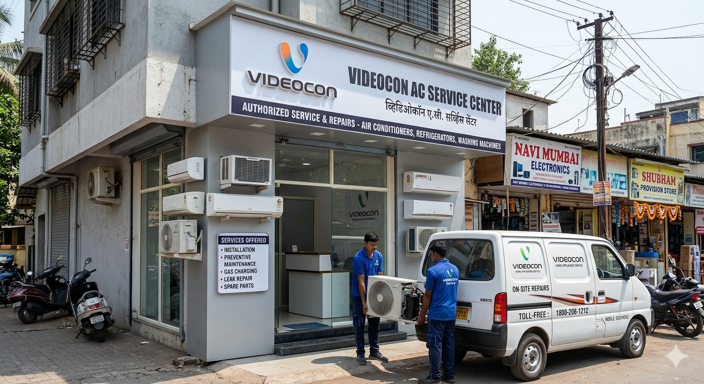
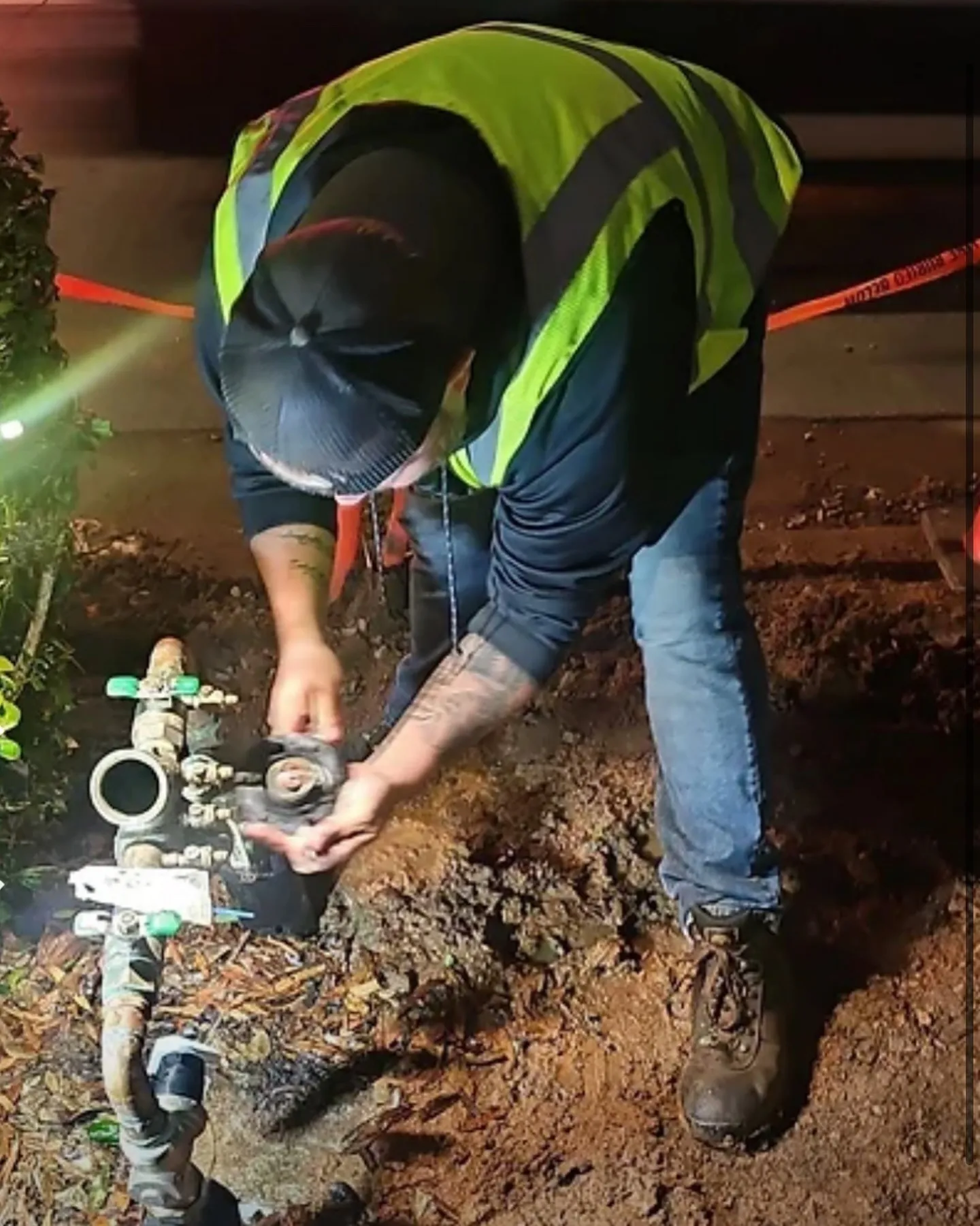
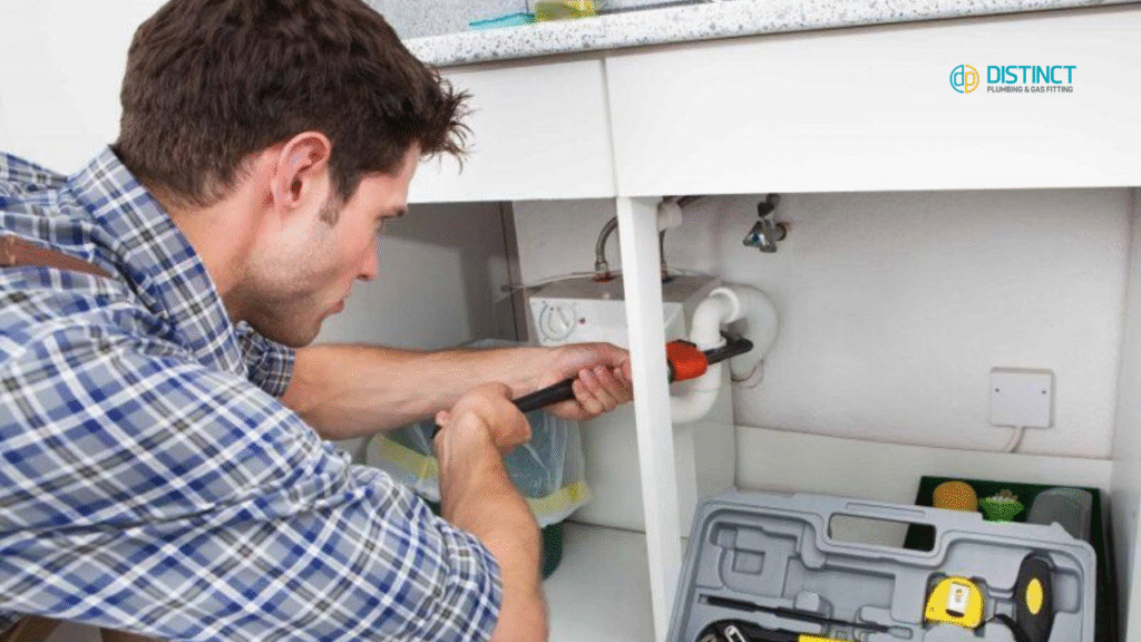
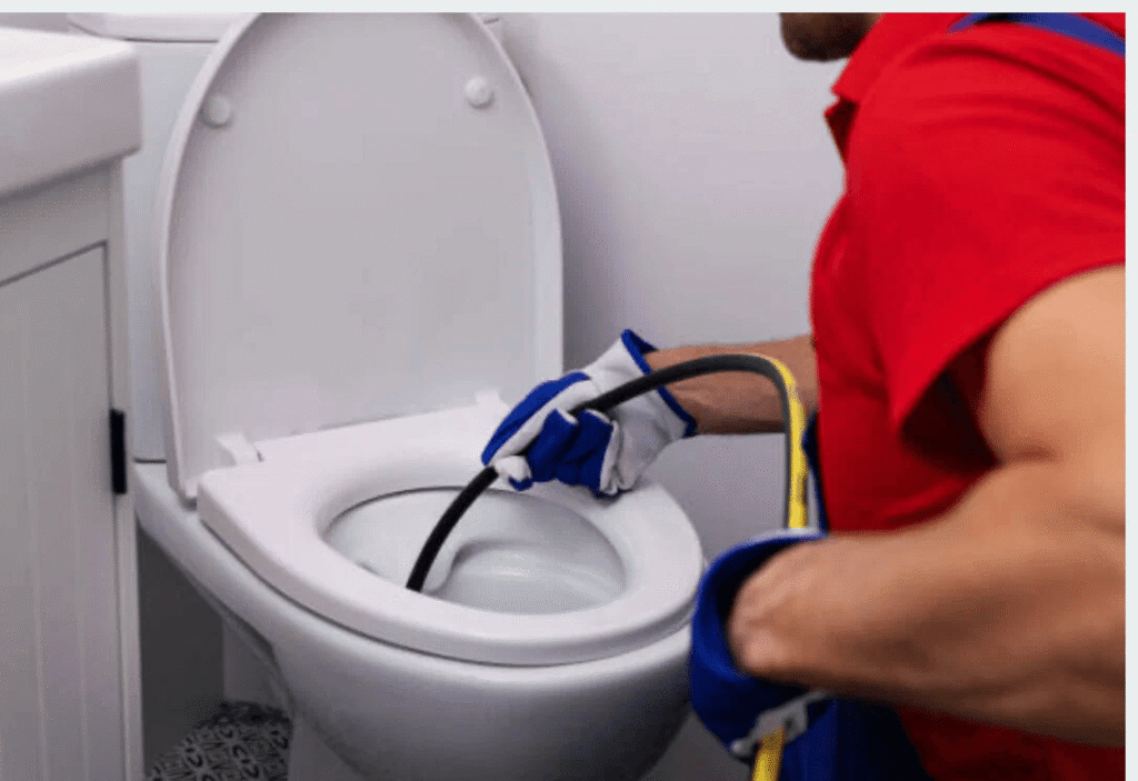
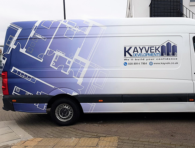
For example, a plumbing company might use a simple, bold logo with a tap graphic and plenty of space around it. No need for a full list of services – just a clean image and clear contact information. The viewer instantly understands who they are and what they do.
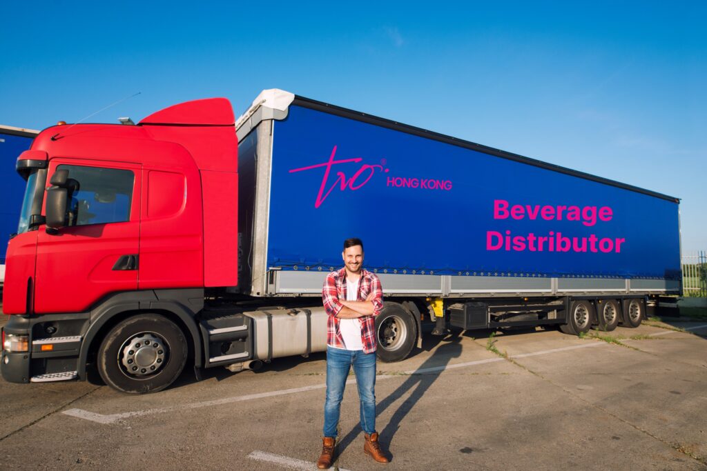
Another example could be a courier company that uses a clever cut-out design where the negative space forms the shape of a delivery box. By keeping the rest of the van clean and uncluttered, the design becomes instantly recognisable.
These examples show how negative space is not just about removing clutter but about creating a strong, clear identity on the move.
Common Mistakes to Avoid
While negative space is a powerful tool, there are some common pitfalls to watch out for:
- Overloading the design: Trying to fit too much information into a small space defeats the purpose of negative space.
- Poor scaling: Designs that look good up close but become unreadable from a distance are not effective for vans.
- Ignoring colour impact: Colours that do not contrast well can make your text and graphics disappear, even if the layout is clean.

Avoiding these mistakes will help you make the most of negative space in your van design.
The Psychological Impact of Clean Design
A van with a clean, simple design not only looks professional but also feels more trustworthy to potential customers.
Psychologically, people are drawn to designs that are easy to understand and visually pleasing. A cluttered, chaotic van might suggest a chaotic business, while a clean, confident design implies a business that is organised, professional, and reliable.
Good use of negative space speaks volumes without saying a word.
Conclusion: Less is More on the Move
In the world of van graphics, less truly is more. By embracing negative space, you can create a design that is bold, memorable, and easy to understand at a glance.
A clean, well-thought-out design will set you apart from the competition and help your van become a moving advertisement that truly works for you.
If you are looking to create eye-catching van graphics that make a real impact, it is important to work with professionals who understand the power of great design. At Sign Company London, we specialise in sign printing and van graphics that use space wisely to make your brand shine.

