

 English


Top 10 Ideas: How to Choose Colors for Custom Packaging

Choosing the right colors for your custom packaging is one of the most important decisions you’ll make when designing your product. Colors don’t just make your packaging look good—they also communicate your brand’s personality, influence customer emotions, and help your product stand out on the shelf. Here are 10 ideas to help you choose the perfect colors for your custom packaging.
1. Understand Your Brand’s Personality
The colors you choose should reflect your brand’s personality. For example, if your brand is fun and playful, bright colors like yellow, orange, or pink might work well. If your brand is more serious and professional, consider using neutral colors like black, white, or gray. Think about what your brand stands for and choose colors that match that vibe.
2. Know Your Target Audience
Different colors appeal to different people. Think about who your customers are and what they like. For example, younger audiences might prefer bold, vibrant colors, while older audiences might like more subdued tones. If your product is for kids, bright and cheerful colors are a great choice. For a luxury product, elegant colors like gold, silver, or deep purple can make your custom printed packaging service look high-end.
3. Use Color Psychology
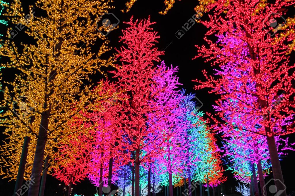
Colors can affect how people feel and behave. This is called color psychology. Here’s a quick guide to what different colors mean:
- Red: Exciting, bold, and energetic (great for grabbing attention).
- Blue: Calm, trustworthy, and professional (often used by tech or finance brands).
- Green: Natural, healthy, and eco-friendly (perfect for organic or sustainable products).
- Yellow: Happy, cheerful, and optimistic (great for food or kid’s products).
- Black: Sophisticated, luxurious, and powerful (ideal for high-end brands).
- White: Clean, simple, and modern (often used for minimalist designs).
Choose colors that evoke the emotions you want your customers to feel when they see your product.
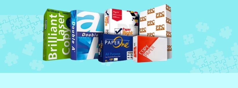
4. Look at Your Competitors
Take a look at what colors your competitors are using. You don’t want to copy them, but you do want to stand out. If most of your competitors use blue, consider using a different color to make your product pop. For example, if you’re in the snack industry and most brands use red, try using green or orange to differentiate yourself.
5. Consider Your Product
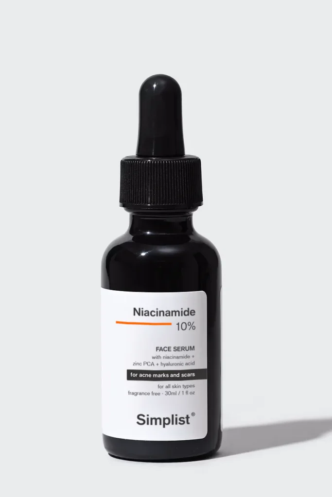
The colors you choose should match the product inside the package. For example, if you’re selling a natural skincare product, earthy tones like green, brown, or beige can communicate that your product is organic and eco-friendly. If you’re selling a luxury item, metallic colors like gold or silver can make your product look expensive and high-quality.
6. Keep It Simple
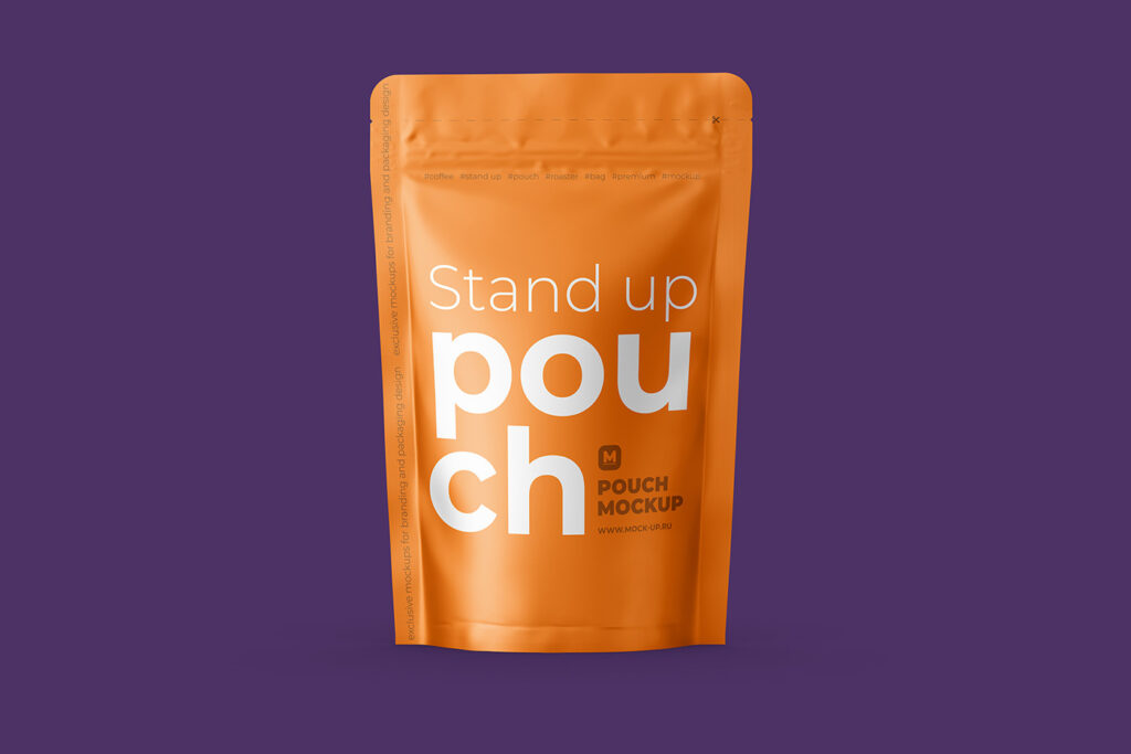
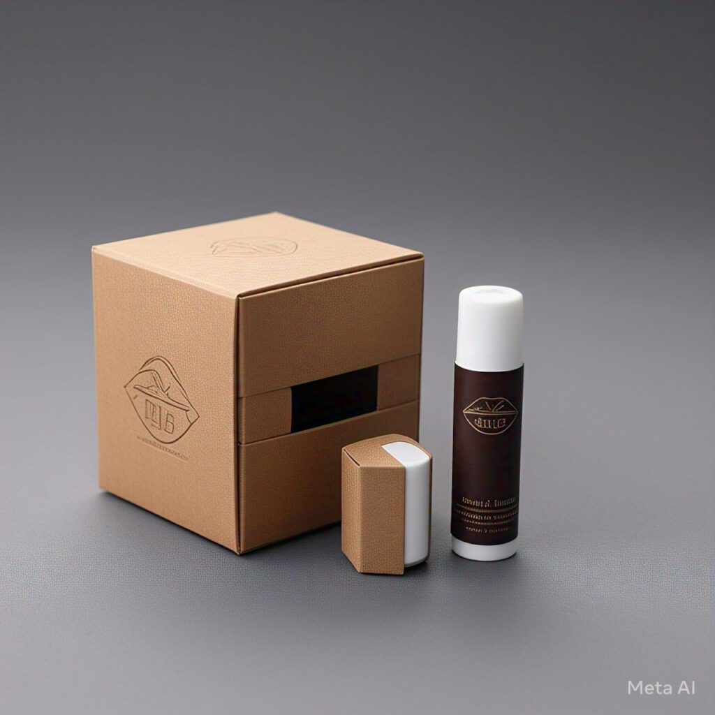
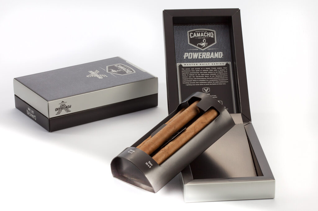
Don’t use too many colors on your packaging. Stick to 2-3 main colors to keep the design clean and easy to read. Too many colors can make your custom printed packaging service look messy and confusing. A simple color palette also makes your brand look more professional and polished. Glo Gang
7. Test Different Color Combinations
Before finalizing your packaging, test different color combinations to see what works best. You can create mockups or print samples to see how the colors look in real life. Ask for feedback from friends, family, or even potential customers to see which colors they prefer. Testing helps you avoid mistakes and ensures you’re happy with the final design.
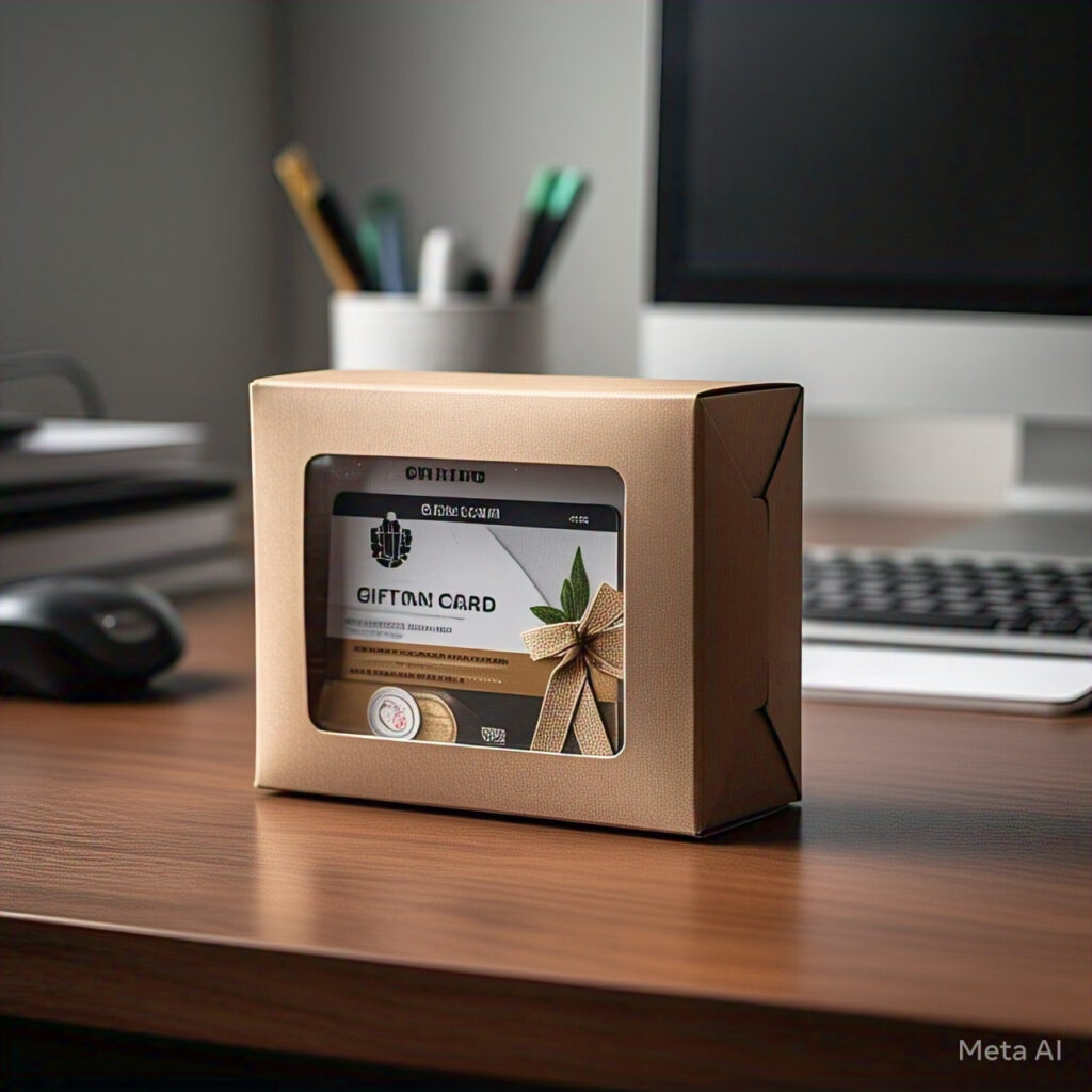
8. Think About Contrast
Contrast is important for making your packaging stand out. Use light colors on dark backgrounds or dark colors on light backgrounds to make your text and images pop. For example, white text on a black background is easy to read and looks sleek. Good contrast also helps customers quickly understand what your product is and why they should buy it.
9. Consider Cultural Differences
Colors can mean different things in different cultures. For example, in Western cultures, white is often associated with purity and cleanliness, but in some Asian cultures, it can symbolize mourning. If you’re selling your product internationally, make sure the colors you choose don’t have negative meanings in other countries.
10. Stay Consistent with Your Brand
Your packaging colors should match the rest of your brand’s visuals, like your logo, website, and social media. Consistency helps build brand recognition and makes your product look professional. For example, if your logo is blue and white, use those colors on your packaging too. This way, customers will instantly recognize your brand, whether they see it online or in a store.
Bonus Tip: Use Trends Wisely
While it’s good to stay up-to-date with color trends, don’t choose a color just because it’s popular. Make sure the colors you pick align with your brand and product. For example, pastel colors might be trendy, but they might not work for a bold, energetic brand. Use trends as inspiration, but always stay true to your brand’s identity.
Conclusion
Choosing the right colors for your custom packaging is a big decision, but it doesn’t have to be overwhelming. By understanding your brand’s personality, knowing your audience, and using color psychology, you can create packaging that looks amazing and connects with your customers. Remember to keep it simple, test different options, and stay consistent with your brand.
The right colors can make your product stand out, communicate your brand’s message, and even influence buying decisions. So, take your time, follow these tips, and choose colors that will make your custom packaging—and your product—shine!
Read more article https://onlinetechlearner.com/