

 English


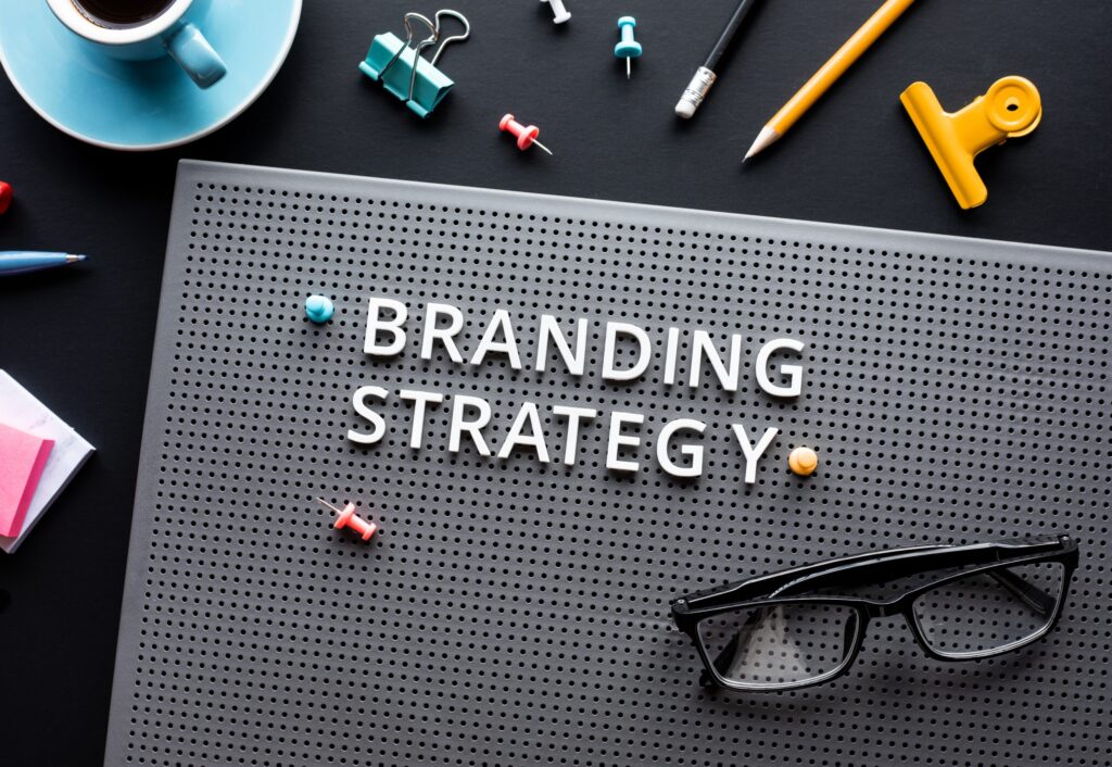


Psychology Exhibit: Choosing the Right Palette for Impact
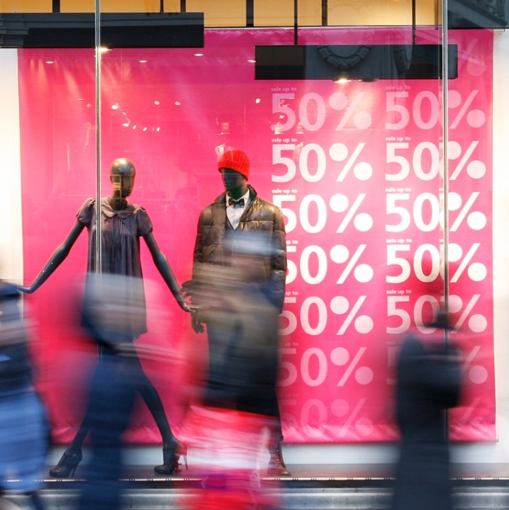
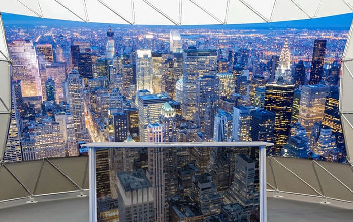
Harnessing the science of colour psychology enables exhibitors to craft display environments that resonate emotionally, guide visitor focus, and reinforce brand values. Strategic selection of hues from warm reds that drive excitement to calm blues that foster trust can elevate perceived professionalism, stimulate engagement, and even nudge purchasing decisions when applied to exhibition display panels and exhibition printing. Thoughtfully applied contrasting palettes and harmonious accents spotlight key messages and product highlights, ensuring your stand remains memorable long after the event. By aligning your chosen colour palette with both your brand personality and emotional preferences, you create an immersive, cohesive experience that captivates visitors and maximises return on investment.
Understanding Colour Psychology in Exhibition Design
Coloring psychology is an examination of how colors influence human behavior and mood. In the context of exhibition design, colours can influence how attendees perceive your brand, products, and overall message. Different colours evoke different feelings and associations, making it crucial to choose a palette that aligns with your brand identity and the emotions you wish to elicit.
- Enhanced Emotional Engagement: Strategic use of colours can evoke specific emotions, helping to create a memorable experience for visitors.
- Improved Brand Recognition: Consistent application of brand colours reinforces brand identity and makes your exhibition display panels stand more recognisable.
- Increased Visitor Interaction: Colours can attract attention and guide visitors’ focus, encouraging them to engage more with your display.
- Optimised Space Perception: The right colour choices can make your exhibition space appear larger or more inviting, influencing visitor movement and interaction.
- Cultural Sensitivity: Understanding colour meanings across different cultures can help avoid misinterpretations and ensure your message is communicated effectively.
Common Colour Associations
| Colour | Psychological Impact | Ideal For |
| Red | Energy, passion, urgency | Food, entertainment |
| Blue | Trust, professionalism, calmness | Technology, finance |
| Green | Growth, health, tranquility | Eco-friendly products, wellness |
| Yellow | Optimism, attention, caution | Children’s products, creative industries |
| Purple | Luxury, creativity, mystery | Beauty products, luxury goods |
| Orange | Enthusiasm, creativity, affordability | Startups, tech companies |
| Black | Elegance, sophistication, authority | Fashion, high-end services |
| White | Purity, simplicity, cleanliness | Modern design, innovation |
Disclaimer: The information provided regarding colour psychology and its applications in exhibition design is based on general principles and observations.
The Science Behind Colour Choices
Research has shown that colours can significantly impact attention and perception. For instance, studies indicate that red hues can enhance focus and attract attention, while purple may lead to longer initial fixations and lower attractiveness ratings. citeturn0search0
Understanding these effects allows designers to create exhibition displays that not only capture attention but also guide the viewer’s emotions and actions.
Crafting the Right Palette for Your Exhibition
When selecting a colour palette for your exhibition display panels and exhibition printing, consider the following factors:
- Brand Identity: Select colours that authentically represent your brand’s core values and messaging. For instance, if sustainability is central to your brand, incorporating earthy tones like greens and browns can reinforce this commitment and resonate with environmentally conscious consumers.
- Target Audience: Different demographics may react differently to hues. For example, younger audiences may be drawn to strong and vibrant colors, whereas older populations may prefer more muted and elegant tones.
- Exhibition Theme and Environment: Make sure the colours used align with the exhibition’s theme and blend seamlessly with the surrounding environment. Choose a palette that enhances visual appeal while maintaining consistency and harmony with nearby displays and branding.
By aligning your colour choices with these factors, you can create a cohesive and impactful exhibition design.
Practical Tips for Implementing Colour in Exhibitions
- Lighting Considerations: Understand how different lighting affects colour perception. Warm lighting, for example, can increase the intensity of orange and red hues, whilst cool lighting can brighten blues and greens.
- Cultural Sensitivities: Be aware of cultural meanings of colours to avoid misinterpretations. For example, in certain societies, white is linked with grief, while in others it represents purity.
- Consistency: Maintain colour consistency across all exhibition materials to reinforce your brand identity and message.
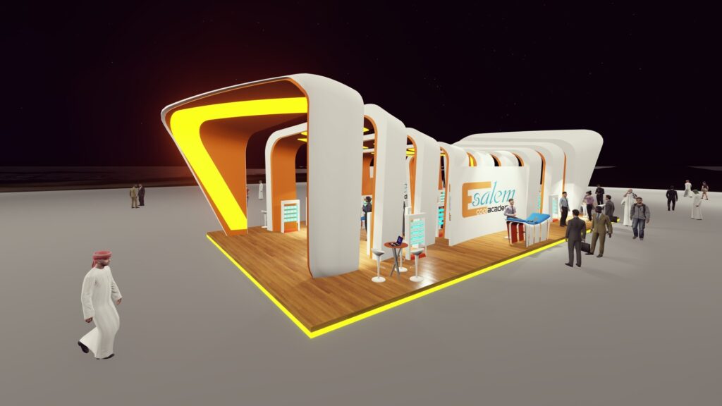
Successful Use of Colour in Exhibitions
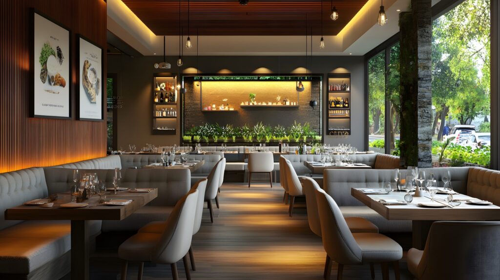
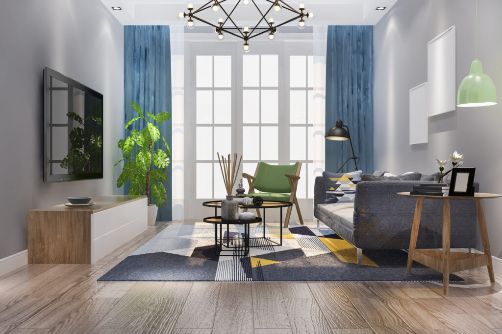
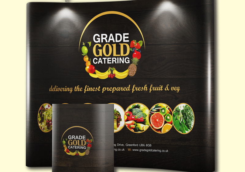
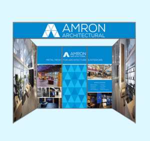
Examining successful case studies can provide valuable insights into effective colour usage in exhibition design. For example, a technology company might use blue tones in their display panels to convey trust and professionalism, while a health and wellness brand might opt for green hues to promote a sense of tranquility and well-being.
What is Exhibition Printing?
Exhibition printing is the expert creation of printed materials designed to increase the visual impact and efficacy of exhibitions, business conferences, and events. This includes a wide range of items such as banners, posters, display panels, signage, and promotional literature, all designed to attract attention and convey key messages to attendees.

Advantages of Exhibition Printing
- Enhanced Brand Visibility: High-quality printed materials help your brand stand out in a crowded exhibition printing space, making it more noticeable to potential clients and partners.
- Professional Presentation: Well-designed and printed materials reflect a professional image, instilling confidence in your brand and products.
- Effective Communication: Printed materials can succinctly convey your brand message, product information, and promotional offers, ensuring that attendees understand your value proposition.
- Cost-Effectiveness: Once produced, printed materials can be used across multiple events, providing long-term value and reducing the need for repeated production costs.
- Engagement Opportunities: Interactive printed materials, such as brochures with QR codes or promotional giveaways, can engage attendees and encourage them to take further action.
By leveraging exhibition printing effectively, you can create a compelling presence at events that not only attracts attention but also drives engagement and supports your overall marketing objectives.
Conclusion
Choosing the right colour palette for your exhibition display panels and exhibition printing is more than just an aesthetic decision; it’s a strategic move that can influence visitor engagement and perception. By understanding the psychological impacts of colours and aligning them with your brand identity and audience preferences, you can create a compelling and memorable exhibition experience. At VC Print, we specialise in providing high-quality exhibition printing services tailored to your specific needs, ensuring your display stands out and effectively communicates your brand message.